Design Aspects

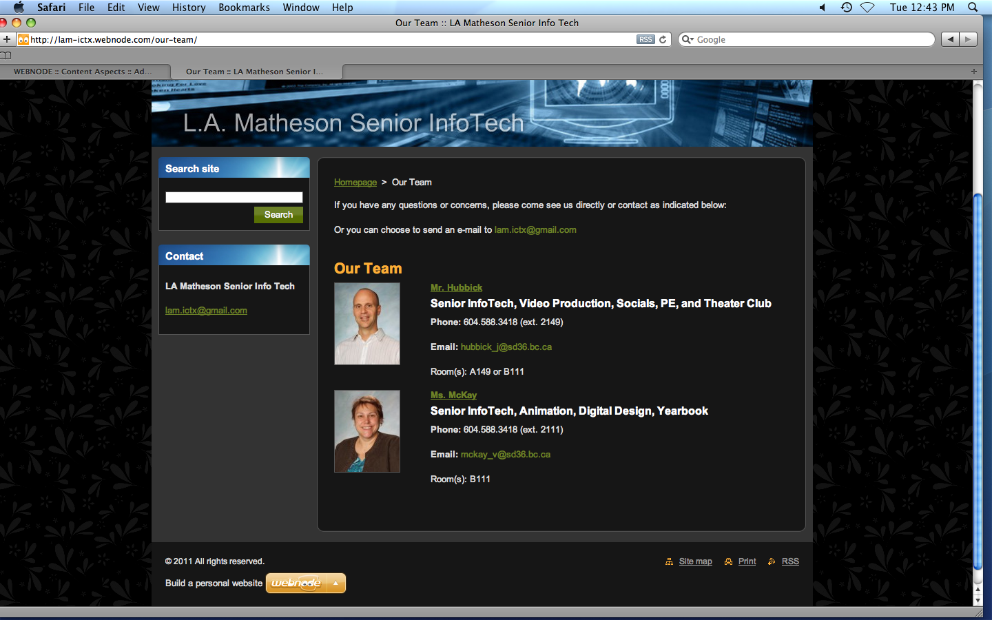
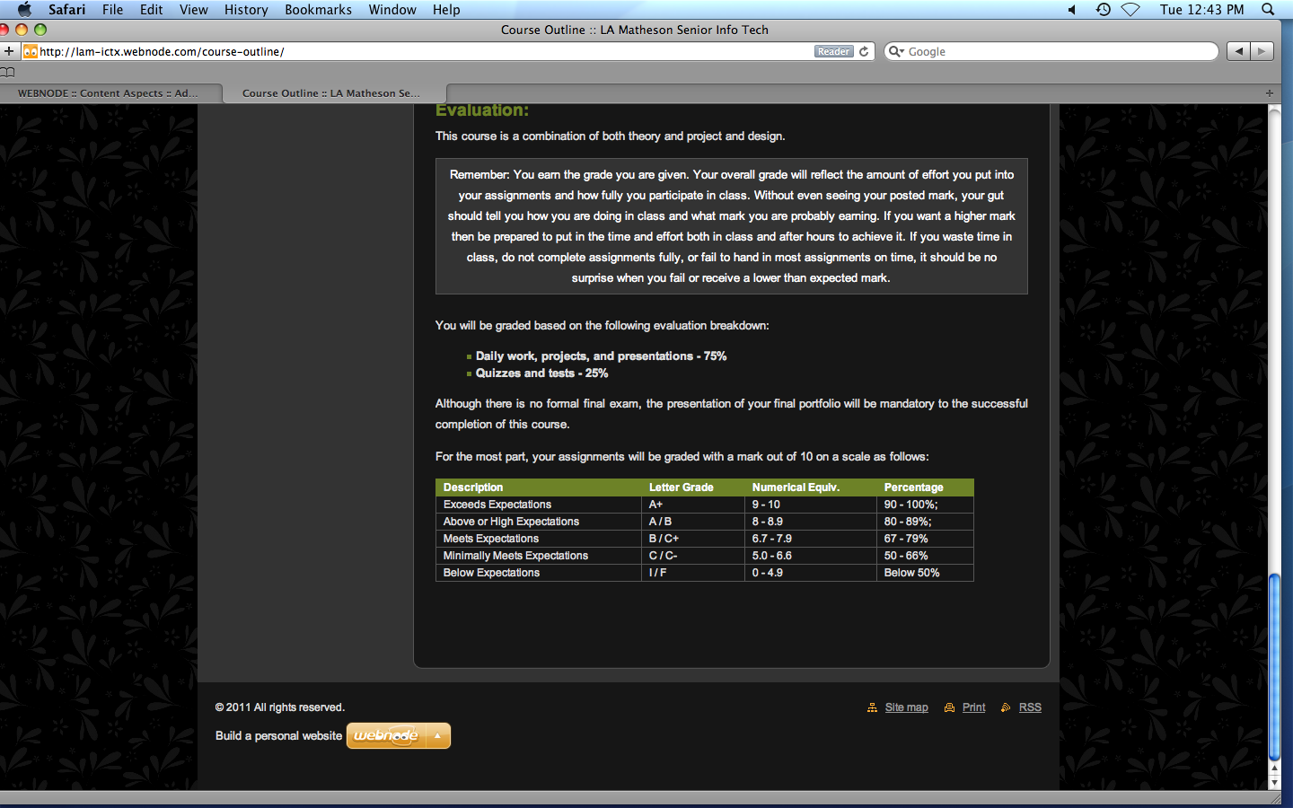
The visual appeal of the website isn't that strong although. The design is very simple and is fit to meet the needs of serving the information only. The organization of the website is very logical. Just by reading the tabs, you can assume where the content is. There is also a search bar in case you are having trouble finding the required information. The readability factor is very high. The contrast ratio between the text and the backgrounds is very high which makes reading the text very easy. The size is very effectively used also. The size difference between the headers and the body text helps distinguish between the two. The body text actually has the perfect size, it’s not too small or too large, good enough to be read and not make the reader feel handicapped. The content is also well distributed through the use of links and external webpages. There is no need to scroll down to far as the information is given at the point where it isn't too much or too little. The website uses menu bars and menu tabs very effectively. I, as a user, found this navigation method very easy to use and finding the required information wasn't at all hard as the tabs very general and specific, both at the same time. The website also uses external links on some of its pages. These are just there as helpers and provide a good set of examples to what the webpage was talking about. I also experienced no issues with the back button. It, like some very annoying sites, does not try to trap you into staying on that one webpage. This only encourages me to re-visit the website which is beneficial to all. This website also includes a site map, which can be used very effectively depending on the knowledge depth of the user. There is also a search bar on every page. Which also makes it easier to navigate throughout the website.

