Design Aspect
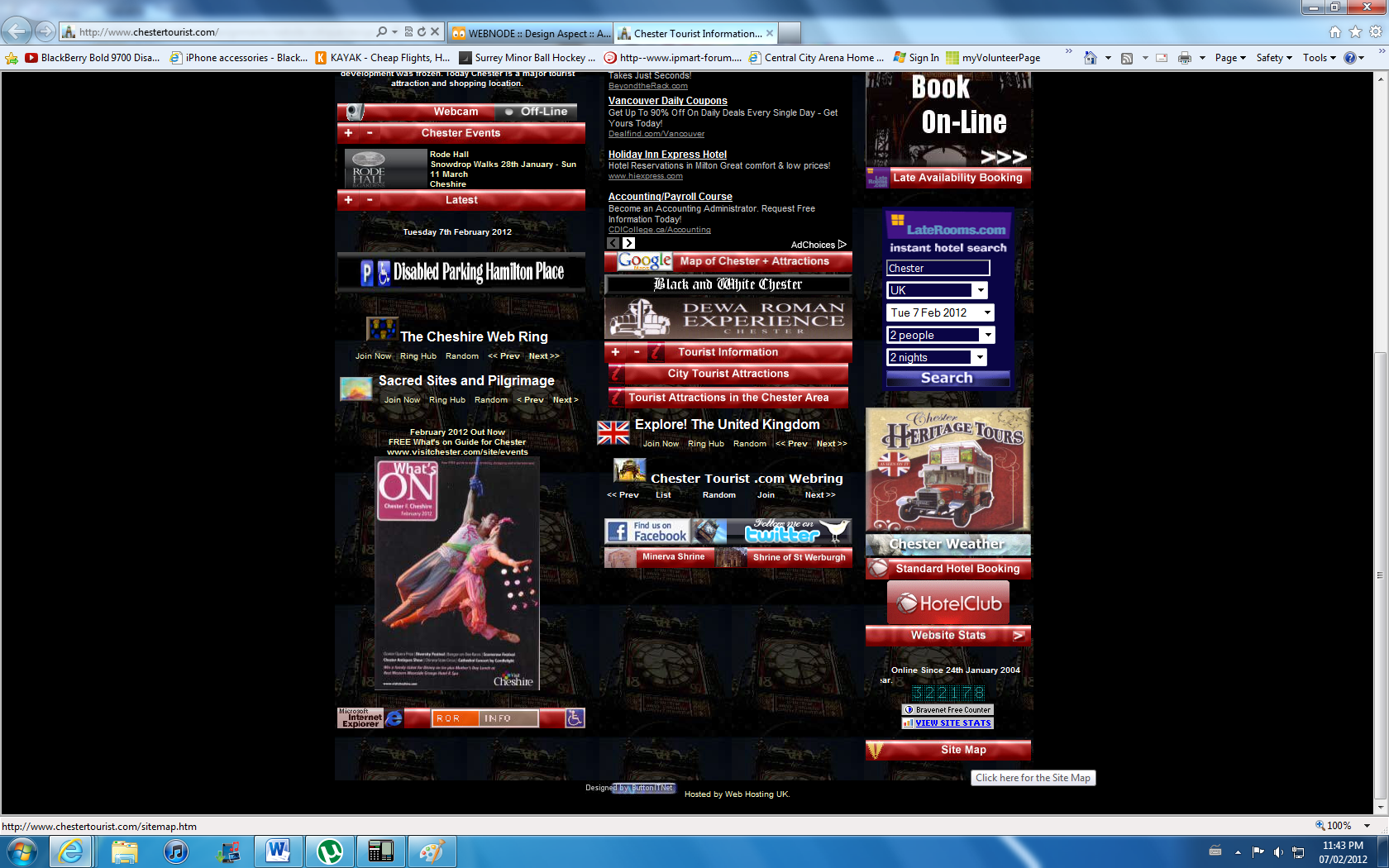
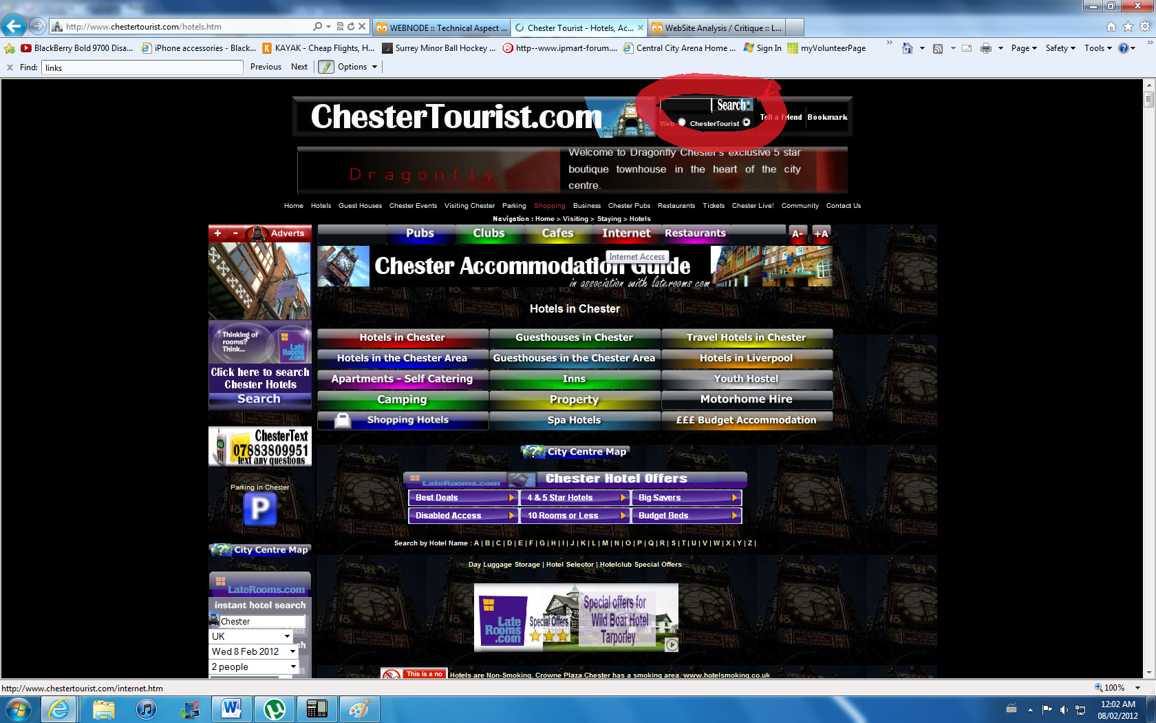
The visual aspect of the website is very strange. It uses all of the bright colors for its menu tabs but when it comes the actually information, it uses black and white. Now the contrast between the background and text is fine, but too much attention is attracted towards the menu tabs. The design is very simple as it is all linear and very basic. The color choices aren't that bad, very simple but completely readable, which is the most important factor at the end of the day. Some pages inconveniently go on forever and the author clearly doesn't know how to use subpages and links to external pages effectively. The widths of the pages are normal so sideways scrolling isn't an issue. The navigational tools the site uses are menu tabs, breadcrumbing, and a search bar. Unfortunately, the size of the breadcrumbing that has been setup is very small and the average user would probably not be able to see it, therefore proabably not be able to have access to this feature. Now it has no menu bar although which can make navigation less accessible to the daily user also. The navigational design to the website is generally very basic. You can tell that the thought of making the website as accessible as possible wasn't an idea properly thought out and dealt with while this site was being created. The site doesn't have an issue with the back button like other sites where the website traps you into either staying on that webpage, or into redirecting you to a page of their advertisers.There is a home button on the pages (both on the menu tabs and near the top where they have setup breadcrumbing). The site doesn't recognize you every time you visit but that isn't that important considering there isn't any login info or any storage of personal information. The site does have many web pages that use links to direct you to related websites, but the unfortunate thing is that the links are in the same color as all the other text which doesn't distinguish the difference one bit. Also, the links open up webpages in that same tab rather than opening up in an external window which can cause a user a lot inconvenience. Luckily, the website includes a site map which makes it much easier for search engines to be able to identify and find information on all pages and it also makes life for the people who know how to navigate the site with the use of a site map much easier, considering the otherwise horrible navigating options setup.